

We are continuing to explore lessons learned by participants from our effective data visualization training series we conducted with Dr. Stephanie Evergreen. I interviewed a few training participants to hear about how their data storytelling has shifted and the larger impacts they’ve experienced.
I had the opportunity to connect with Erin Chambers, Visual Communications Designer from the Missouri Coalition Against Domestic & Sexual Violence (MOCADSV) to learn how data storytelling is evolving for state coalition staff.
NSVRC: What brought you to the data visualization workshops?
Erin Chambers: When I was hired as a graphic designer at MOCADSV in February 2021, we experienced technical difficulties which rendered me unable to do design work for several weeks. Anxious to fill the time wisely, I was excited for the announcement of Dr. Evergreen’s workshop. I was especially intrigued by the Chart Chooser graphic available prior to the workshop. Having spent a decade in newspaper and yearbook design, I’ve often desired a tool to help narrow down the huge variety of infographic options.
During the presentation Dr. Evergreen’s enthusiasm for the topic of data visualization was contagious and left me inspired.
What did you learn, and how did you apply it to your prevention work?
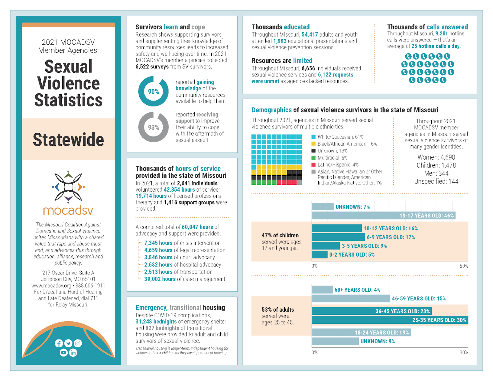
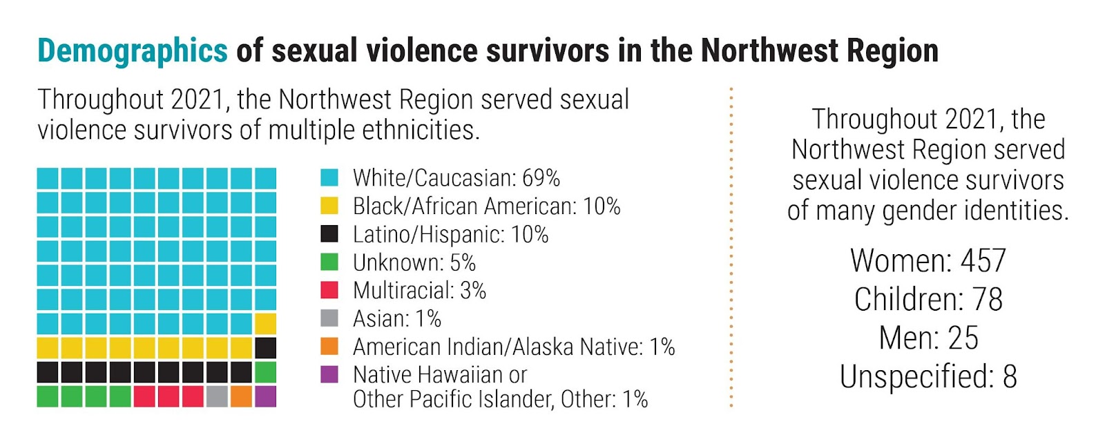
First up for a data visualization facelift was our Stat Sheets. MOCADSV publishes this annual series featuring statewide and regional data collected from our member agencies on the extent of services requested and provided, including prevention and educational events.
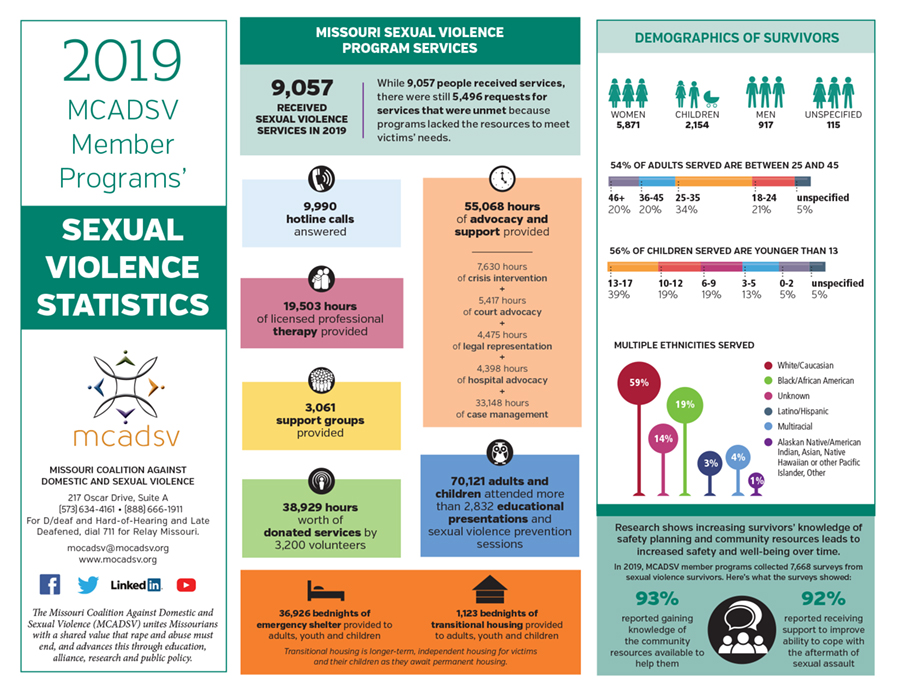
For years our member agencies have used the Stat Sheets in their own awareness and fundraising campaigns. The Stat Sheet redesigns featured infographics and techniques from Dr. Evergreen’s lecture, including waffle charts, dot charts, donut charts and pictograms.
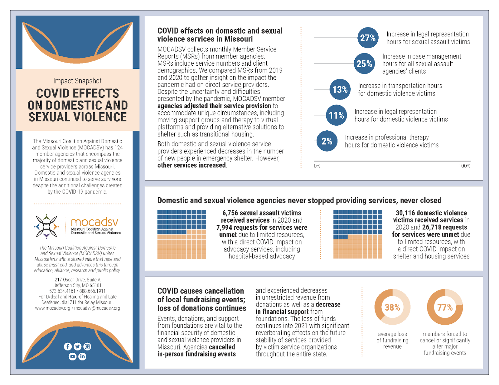
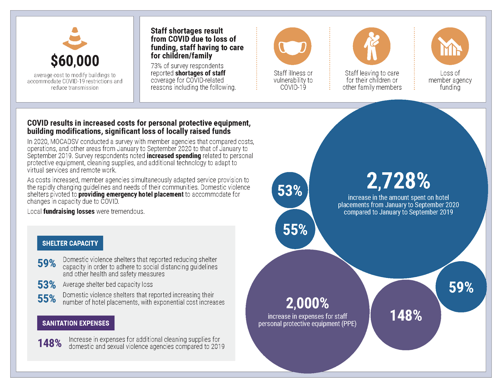
COVID also presented a unique opportunity to polish our data viz. Following the positive reception of the Stat Sheets, the Coalition produced an Impact Report (also shared below) to help tell the story of what member agencies experienced during the first year of the pandemic. These standalone data viz-heavy reports also helped further our storytelling efforts in public policy advocacy. Advocates used our Stat Sheets and Impact Report for their legislative meetings during our Missouri Capitol Advocacy Days, and received positive feedback from lawmakers.
What impacts have you seen since using your new skills?
Since being introduced to data visualization and continuing to explore the field, the coalition’s designs have been tremendously impacted in numerous projects. Especially relevant were Dr. Evergreen’s lessons about using strategic color choice to boost graphic narratives and utilizing informative chart titles (such as “hotel placements spike amid reduced shelter capacity”) which cut to the heart of the matter. Now that I’ve been made aware of the trend, I notice narrative headline-style graphic titles employed more often than not.
One notable update we made in our new Stat Sheet design following Dr. Evergreen’s webinar was presenting our survivor demographic data as a waffle chart rather than the traditional pictogram featuring bathroom-style icons of men and women. On one hand these icons can help generate empathy, but on the other hand they may alienate gender non-conforming folks.
I can’t wait to continue using data visualization to spice things up when MOCADSV revamps our Latest in Data publication! There’s still so much to learn.
Do you have any data visualization tips or suggestions for other folks working to prevent sexual harassment, abuse, and assault?
While I created the Stat Sheets and Impact Report in the Adobe Creative Suite, Dr. Evergreen’s website has a huge library of tutorials and articles about how to create graphics in Excel. A computer-savvy staffer can certainly create beautiful infographics without the use of costly software - so if you’re on the fence, don’t let unfamiliarity with professional design programs keep you from exploring data viz. Everyone starts out with bar and pie charts before trying their hand at ambitious graphics like packed bubble charts and dot plots.
I’d also advise the use of icons if you have a project featuring a lot of qualitative data. Marrying traditional data viz elements and bulleted lists featuring icons can keep potentially dry or dense data both approachable and fresh.
As far as color goes, pick palettes with racial equity awareness and make your color schemes accessible for those with vision impairments such as color blindness. This is a tricky endeavor and I recommend exploring the Do No Harm Guide: Applying Equity Awareness in Data Visualization resource from the Urban Institute.
Some of my other favorite sources for data visualization inspiration are Statista’s Chart of the Day and Flowing Data. I’ll often pick an inspirational image and mimic it on a smaller scale with our own data, colors and narrative elements.
Why do you think effective data visualization is important for our field?
One of the core values of MOCADSV is education. As our website expresses, “We believe that education advances understanding, that understanding furthers unity, and that the active expression of our unity results in the prevention of violence.”
Sharing statistics with legislators and community members is vital. One of the first things advocates share in our work when expressing why the movement is important is this ubiquitous statistic: “One in five women in the United States experienced completed or attempted rape during their lifetime.” (Smith et al., (2018)
Knowing the power of statistics to cut to the heart of the matter, we also must recognize that if they aren’t paired with visually engaging graphics, they can become background noise. A barrage of listed statistics can also depersonalize the issues of domestic and sexual violence. As Tim Meko of the Washington Post states, “These are not just data points, and so when you add them as dots on a map, or lines on a chart, I think you have to remember that these are true people.” (Schwabish & Feng, 2021)
_____________________________________________________________________________________________________________________
Read our first story from Renu (Re) Gupta, Interpersonal Violence Prevention Programs Coordinator at the Colorado Department of Public Health and Environment.
To see more about what we are learning about best practices for sexual violence prevention program evaluation, visit https://nsvrc.org/evaluation-toolkit
If you are just getting started with data visualization, check out this self-paced study guide: https://www.nsvrc.org/resource/2500/self-study-plan-introduction-data-visualization-beginner
This piece was authored by Sally J. Laskey, NSVRC Evaluation Coordinator and Guest Blogger Erin Chambers, Visual Communications Designer, Missouri Coalition Against Domestic & Sexual Violence
References
Smith, S. G., Zhang, X., Basile, K. C., Merrick, M. T., Wang, J., Kresnow, M., & Chen, J. (2018). The National Intimate Partner and Sexual Violence Survey: 2015 data brief – updated release. Centers for Disease Control and Prevention.
Schwabish, J. and Feng. A., (2021). Do No Harm Guide: Applying equity awareness in data visualization. The Urban Institute.