
When the pandemic hit and we weren’t able to meet in person like we usually do with our Rape Prevention and Education (RPE) partners, we realized we needed a new plan. Part of the new plan included a fantastic partnership with Dr. Stephanie Evergreen to conduct a series of virtual trainings on effective data visualization. These trainings have forever changed the way we tell our prevention stories. To help us share some of the key lessons we learned, I gathered stories from a few training participants to share how their data storytelling has shifted and the larger impacts they’ve experienced.
Read our first story from Renu (Re) Gupta, Interpersonal Violence Prevention Programs Coordinator at the Colorado Department of Public Health and Environment below.
I only learned about Data Viz as a concept, practice, or lifestyle in joining the State of Colorado; we had a staff Data Vizard and I was intrigued by the work he supported and how. He left our team, but my interest was piqued! Around this same time, I came to learn of Dr. Stephanie Evergreen and the Evergreen Academy. NSVRC hosted a workshop for RPE teams and I was hooked! (thanks Sally!!) As a non-Public Health person, I’ve always found the high-academia of data and statistics reporting to be somewhat confusing, distracting, or off-putting… but Dr. Evergreen’s coaching flipped that all on its ear.
This felt incredibly important to our work in CO-RPE, because so much of our program is guided by community and “civilians,” and data visuals that were too much to easily digest were getting in the way of our engagement and progress with our priority communities. The rest is history, you could say– I got the data viz bug and have been enthusiastically infected since!
Previous to joining CDPHE, I’d worked in teaching/education and youth development spaces, so the idea of “What are you trying to say?” informs a lot of my presentations or workshops. In bringing this approach to our data and the ways we visualize it, I was able to cut out a lot of the noise and distractions that interfered with our key takeaways being fully useful, understood, and germinating conversations around violence prevention solutions and strategies. Basically, I was spending too much time explaining the data viz and not enough time connecting its meaning to human lives and experiences.
The alternatives to pies or bars as visualization were game-changers; one example I keep in my go-to data viz toolbox is the bar-in-bar chart [see below] that shows embedded contrasting data, like the impact made compared to the opportunity population potential.
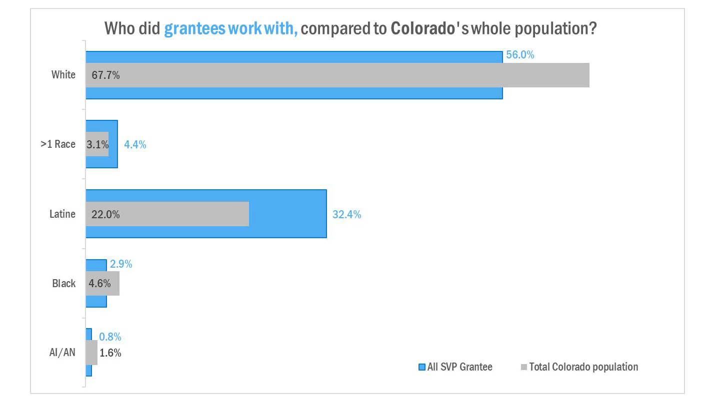
In presenting this data viz back to our grantees, their work took on a different meaning! And this small journey turned into a full adventure as I realized: CONTEXT!
That is to say: beyond the visualization of the data, was the data being presented with the most useful pieces of itself? Was there more to the story– and if so, what was it, how do we connect that and visualize it? My worry was that if I used more information, the message would get too heavy or turn off-topic, and I’d lose people along the way.
Part of the most important piece I learned from the NSVRC gatherings was how to “serve the plate” of data. Instead of making one intense, bombastic slide that would blow everyone’s wig off, I made more slides– but with easy-to-understand messages and visualization. Walking step by step through a series of 3 or 4 visuals and connection points took much less time and effort, versus presenting a data leviathan. With the newfound time, we as a team– and our audiences– were able to focus on using the data points to guide our creativity and discussions, which led to more robust conversations with grantees or community, and more innovative ways to address sexual violence prevention.
The impacts made by better visualization and connection points has really enhanced our engagement and the ways we regularly seek to improve our program and the quality of our work. Being able to clearly and easily message the heavy crunchy fiber of our data and findings, removed so many of the barriers to communication with our non-Public Health partners.
"At the end of the day, nobody wants to feel dumb or talked down to, but the old ways we were doing our data viz inadvertently came across as condescending and excluding some voices from informing our work. "
We’ve spent some time and energy focused on not only data viz, but equity in data; the work Heather Krause does with We All Count is invaluable to community-level prevention work, in that the concepts of equity are embedded from the first moment of any data work. Beyond the reported data and how we speak to our findings, there was a new dynamic of “who holds power in this data?” We walked through who holds funding, who holds information, who shares what with whom, and where accountability comes into play for various systems at all points of our programming. While an intense process, it was worth every second and every brain cell we put into it, because we came away with greater insight to our own work and who was impacted (and how) in a full-360 sort of view that was previously not considered.
As we take our new big brains forward, the biggest and most valuable lesson from our data viz expedition with NSVRC and other RPE states is this: All of our data is not numbers. Not even the quantitative data. It IS human lives. It is parents and partners, children and colleagues, leaders and left-behinds… and it is our responsibility to give our data the embodiment of human life in order to best message our work, our impacts, our gaps, needs, and unanswered questions. Every data viz I produce now begins with asking “What am I trying to say here?” and then working backwards from the takeaway as a heading or caption, and how to visualize and contextualize that lead-in. A great tool in this process is Dr. Evergreen’s Chart Chooser (on her website, interactive or in card-deck). Actually her whole blog! I also love Heather Krause’s data biography tool, funding-web builder, and identity sorting dials; these keep me on the path and focused, when it’s just too easy to get off track and rabbit hole into the whole ‘data and equity’ existentialism. Other things I like? The work of Grandmother Strong Oak LeFebvre and Visioning B.E.A.R., Abigail Echohawk, “The Algorithms of Oppression” book, “Sexual Citizens” and the Columbia University SHIFT project, and “Coded Bias” documentary on Netflix. Together with NSVRC’s support and challenge to learn and grow, this was a perfect recipe for Nerd Salad, and I am eating it with a spoon!! :)
___________________________________________________________________________________________________
Read Part 2 to learn about our interview with Erin Chambers from the Missouri Coalition Against Domestic & Sexual Violence
To see more about what we are learning about best practices for sexual violence prevention program evaluation, visit https://nsvrc.org/evaluation-toolkit
If you are just getting started with data visualization, check out this self-paced study guide: https://www.nsvrc.org/resource/2500/self-study-plan-introduction-data-visualization-beginner
This blog was authored by Sally J. Laskey, NSVRC Evaluation Coordinator and Guest Blogger Renu (Re) Gupta, Interpersonal Violence Prevention Programs Coordinator, Colorado Department of Public Health and Environment